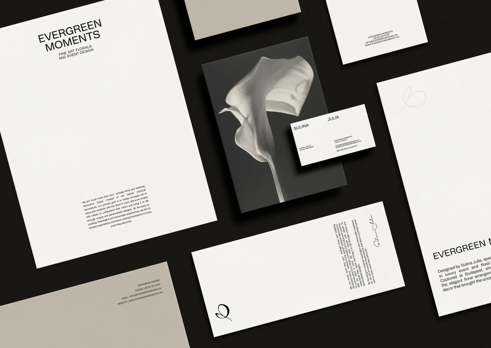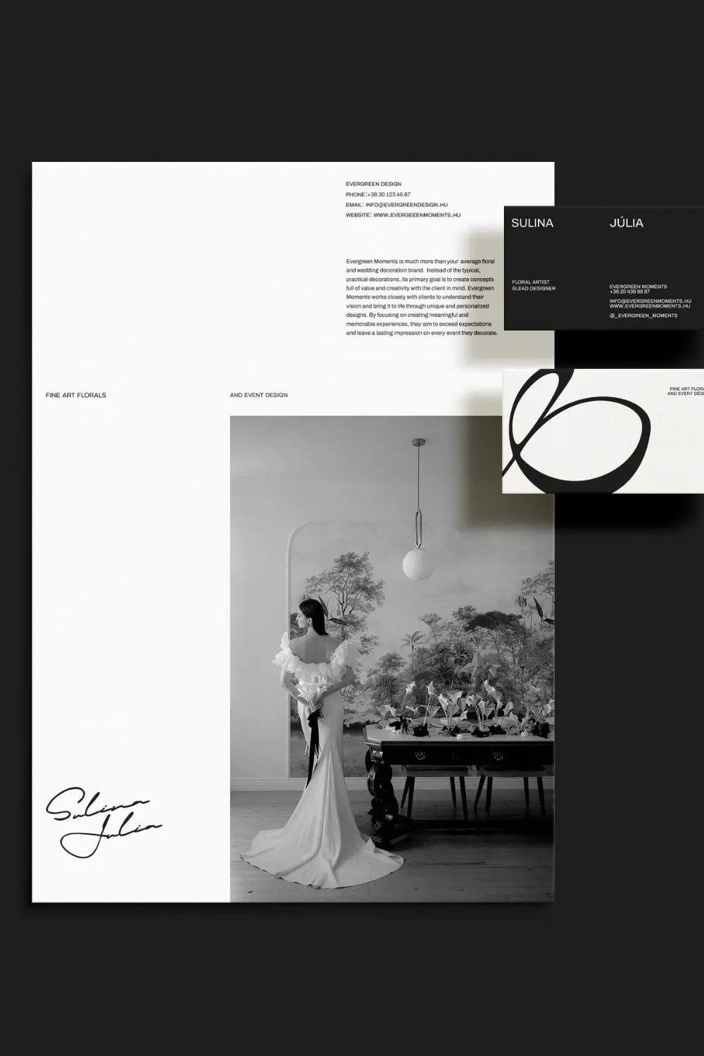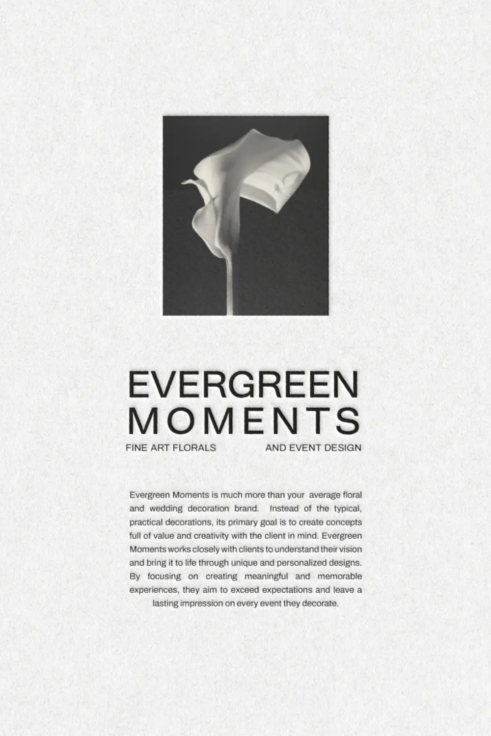
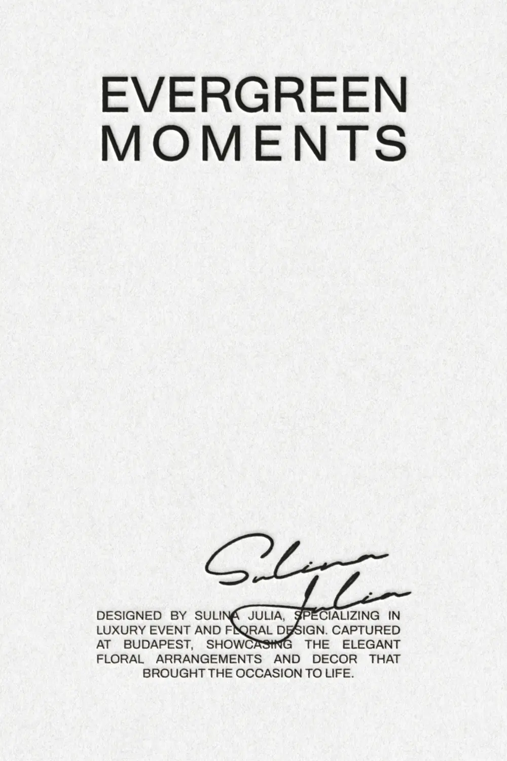
EVERGREEN MOMENTS
Fine Art Florals and Event Design
Evergreen Moments is so much more than your average floral and wedding decoration brand. Instead of the typical, practical decorations, Their primary goal is to create concepts full of value and creativity with the client in mind. They work closely with clients to understand their vision and bring it to life through unique and personalized designs.
My intention was to reflect these values in the visual identity.
Júlia wanted to give her brand a more modern aesthetic while still finding it difficult to let go of the nature-inspired, somewhat bohemian style that was so close to her heart. I didn’t want to put her in a tough position, so I tried to combine the two.
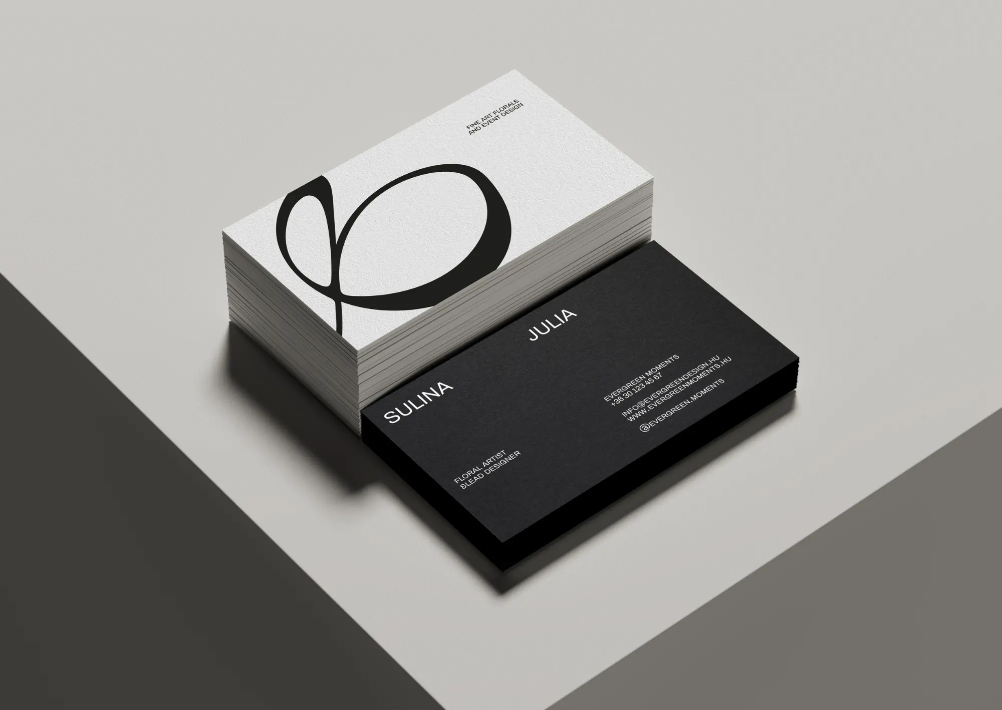
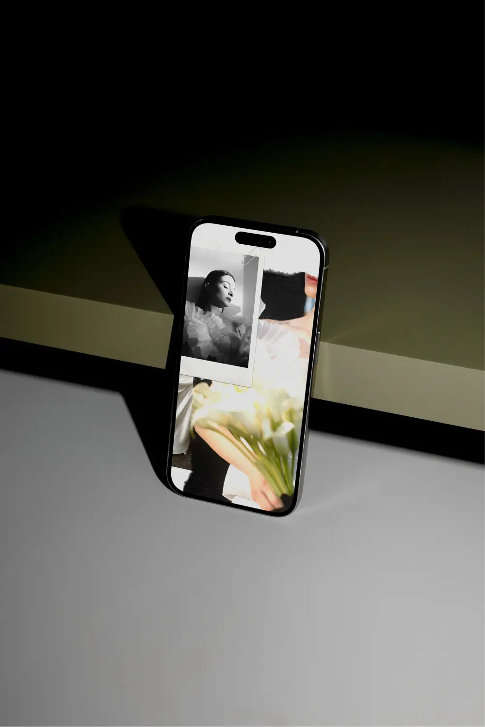
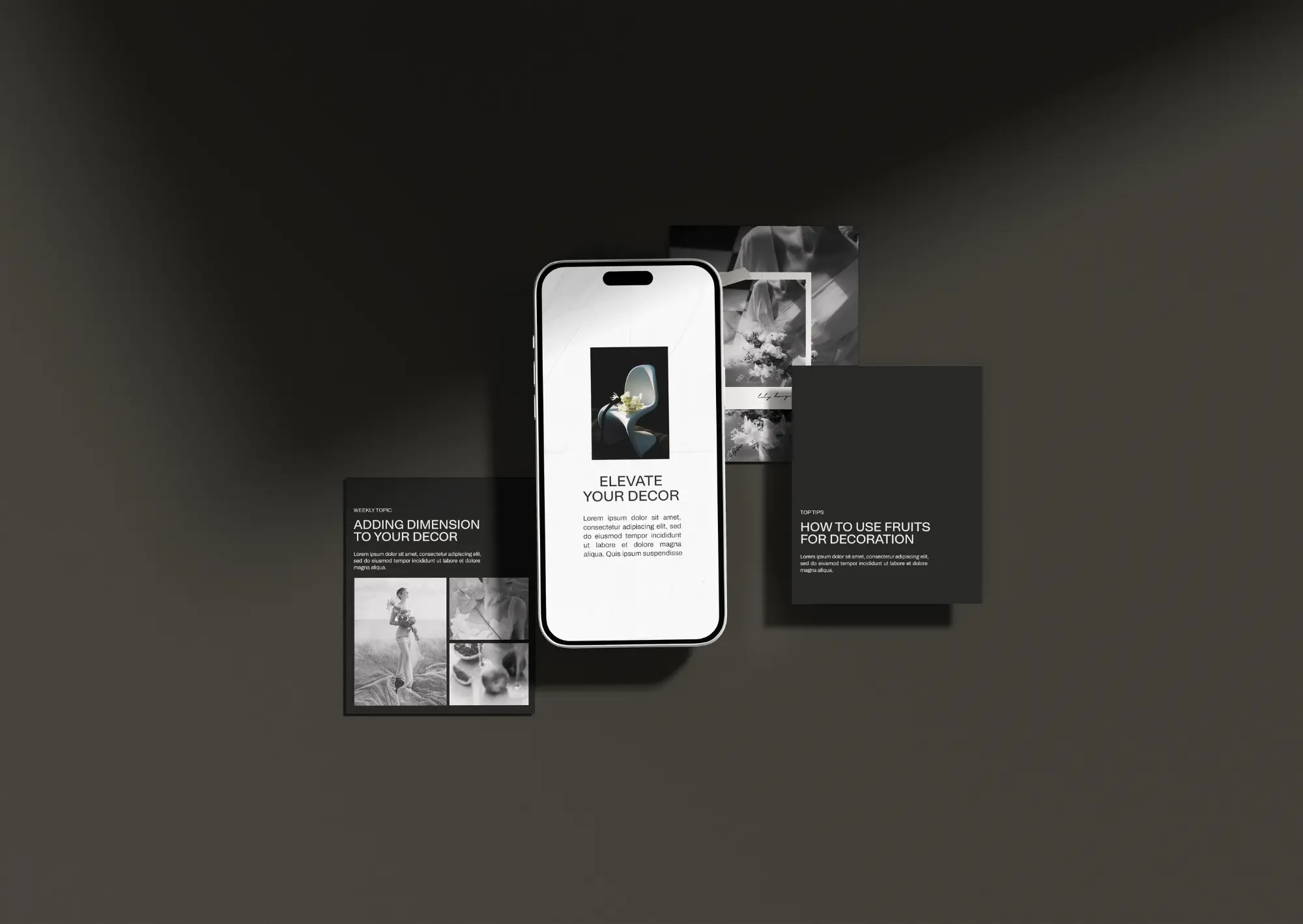
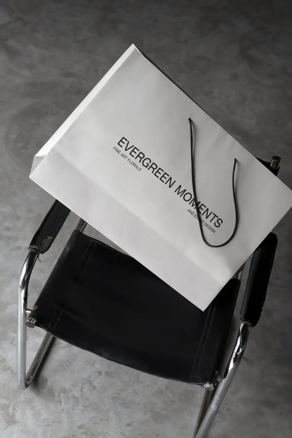
The main brand elements, such as the logos, primary fonts, and colors, all create a clean, modern vibe. These elements are subtly softened by colors, handwritten fonts, playful layouts, and textures primarily used on social media.
In her work, Júlia always strives to ensure that her unique vision shines through in her creations and that they live on as lasting memories, rather than simply following current trends. I didn’t want the brand identity to distract from Júlia’s work; rather, I aimed for it to complement and frame it. That’s why I chose more restrained, yet professional, bold fonts, balanced by a much more natural, softer icon logo that we created together through compromise.
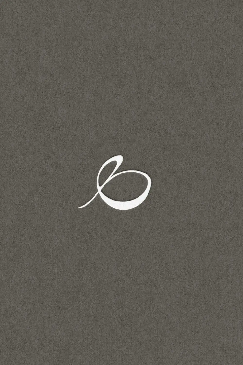
As is typical for me, it naturally carries multiple meanings: it partially refers to the letter ‘e’ from the brand name and also represents an abstract flower bud, which ties back to the brand’s field of work.
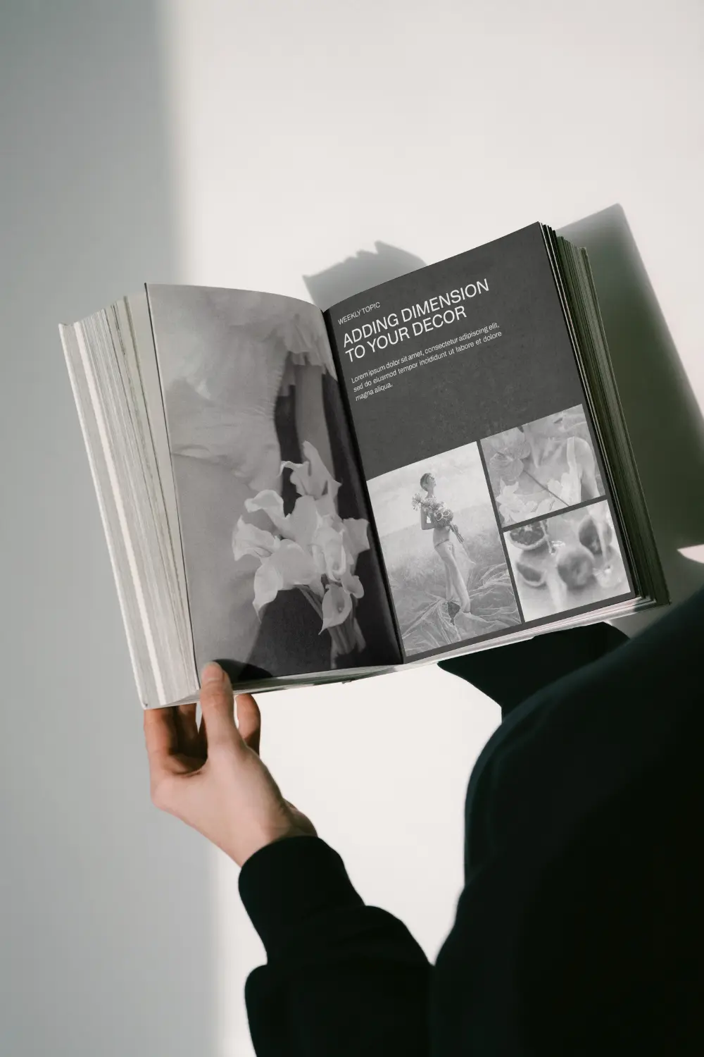
While working on the social media templates for Evergreen Moments brand identity, I wanted to focus on the portfolio aspect—using less text and more image elements. Since Julia asked to keep her old brand identity’s natural sense, I used textures and other removable elements like clippers and tapes.