Spirit Island
Where luxury meets tranquility.
Spirit Island is more than a massage salon—it’s a tranquil escape. Our mission is to create an exclusive haven where luxury meets tranquility, offering each guest a deeply personalized journey of rejuvenation and balance. Every touch, every detail, every moment is designed to soothe the body, mind, and soul in an environment of elegance and sophistication.
Spirit Island radiates exclusivity, offering a deeply personalized experience tailored to each guest. Rooted in the rich heritage of Thai massage techniques, the brand honors tradition while delivering a modern and luxurious approach. Every treatment is crafted with a focus on quality, promoting holistic well-being in a setting of refined elegance and warmth.
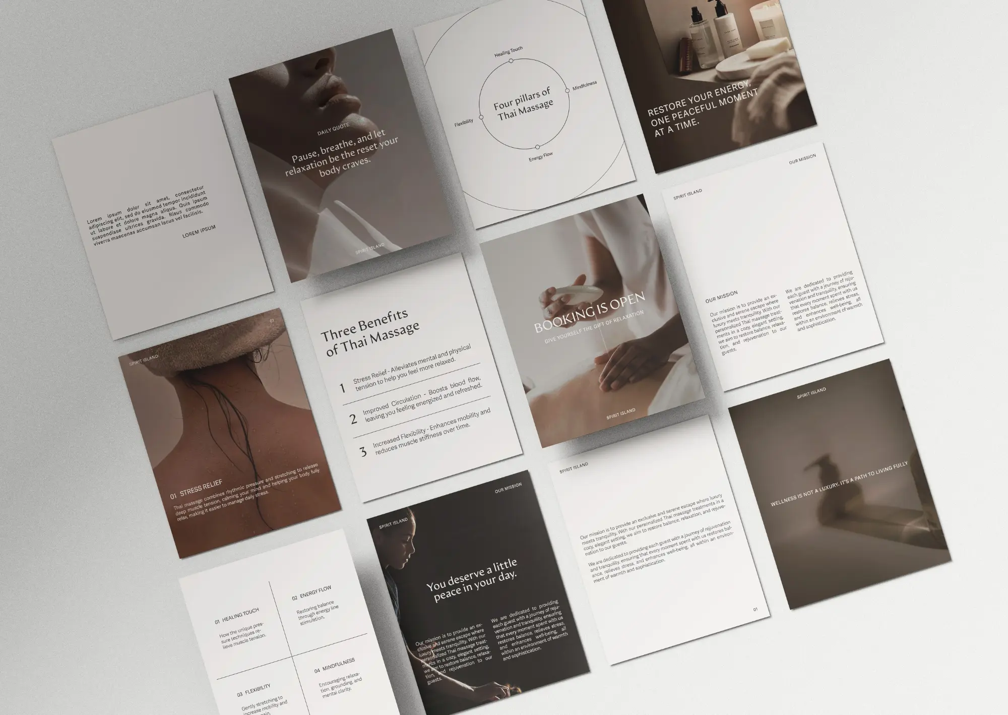
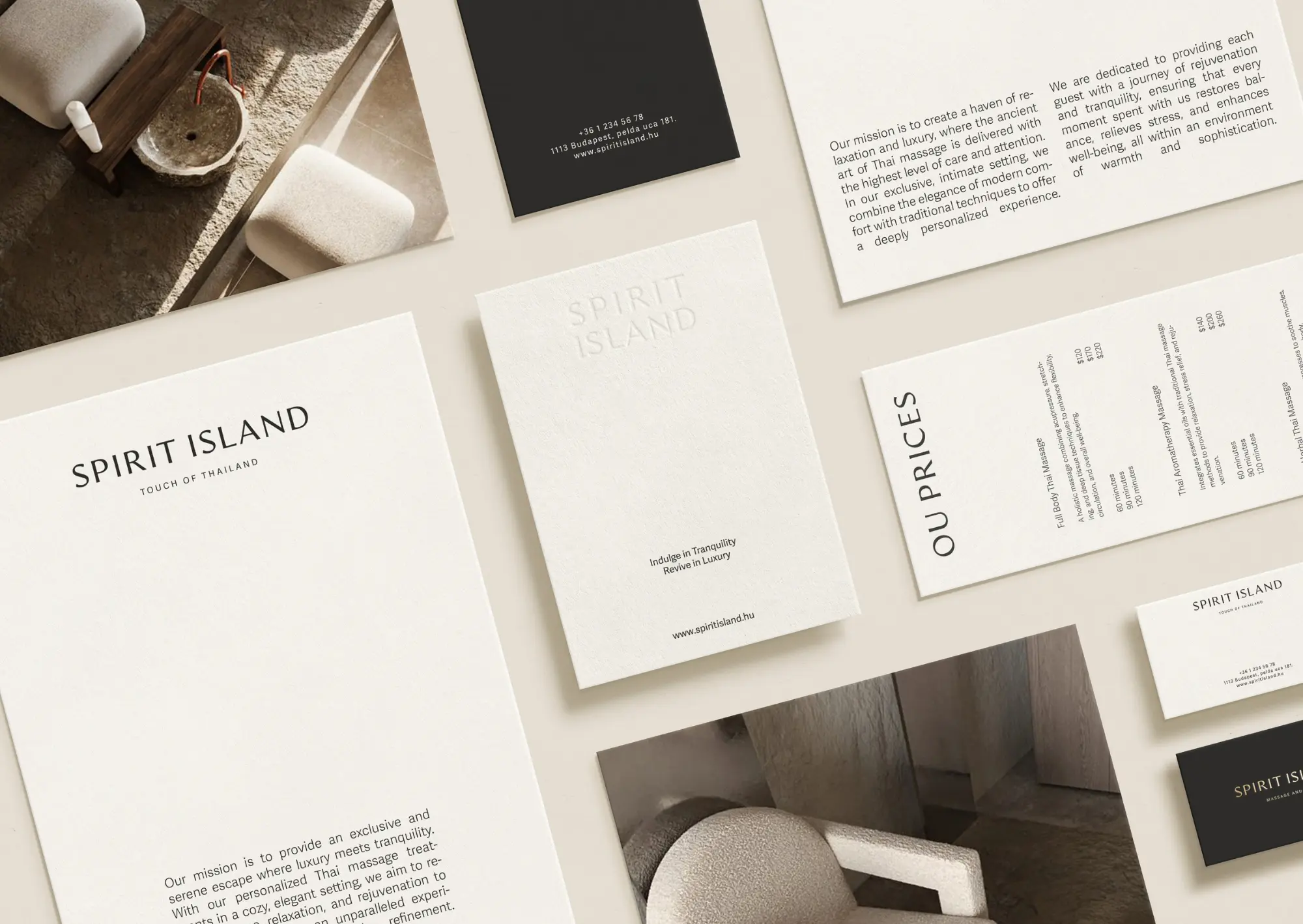
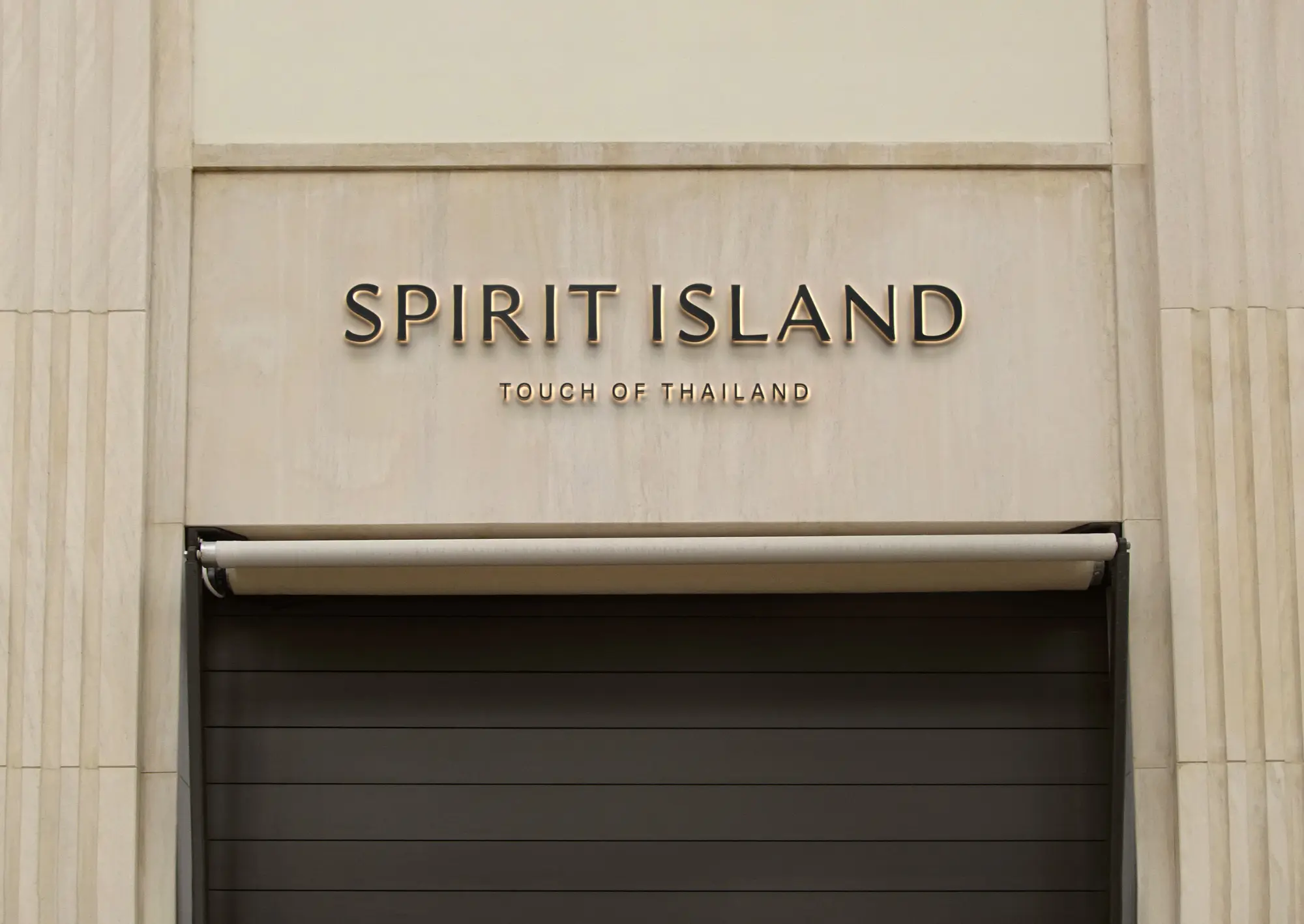
The brand’s typography is clean, modern, and minimal, reflecting a commitment to sophistication and simplicity. Neutral, cool tones dominate the color palette, evoking calm, trust, and natural beauty—perfectly aligning with the soothing nature of our Thai massage treatments.
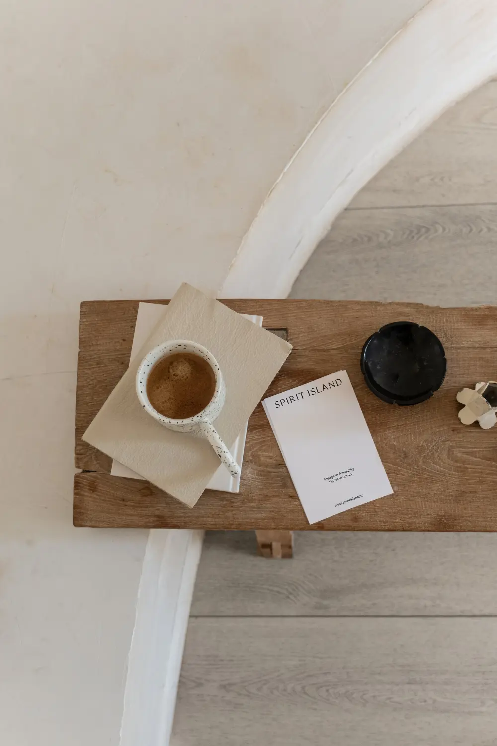
We designed a variety of printed materials, including the gift voucher, to complement the Spirit Island identity.
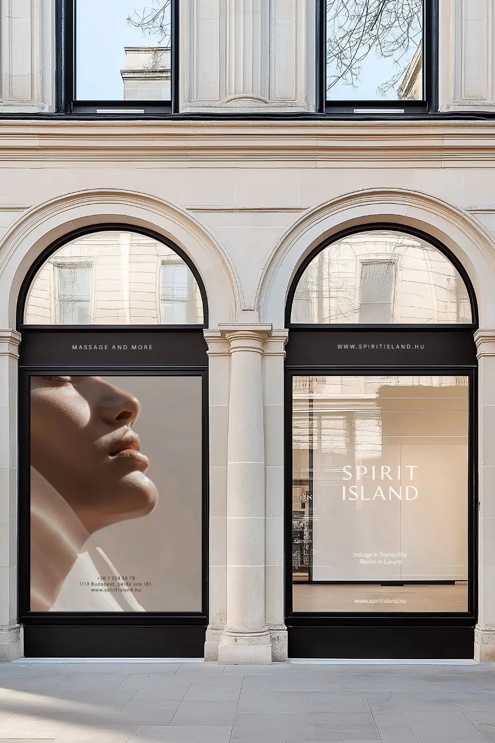
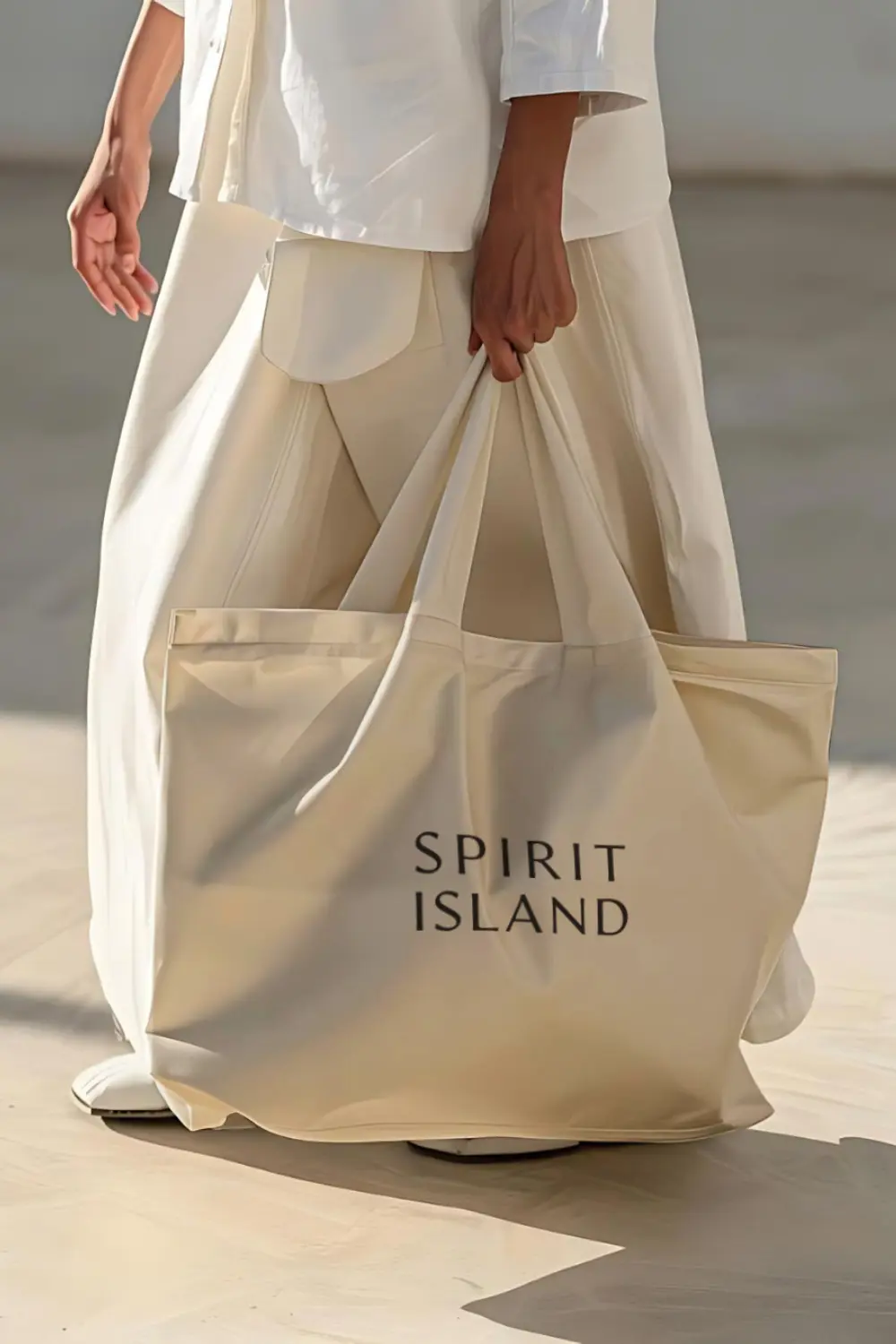
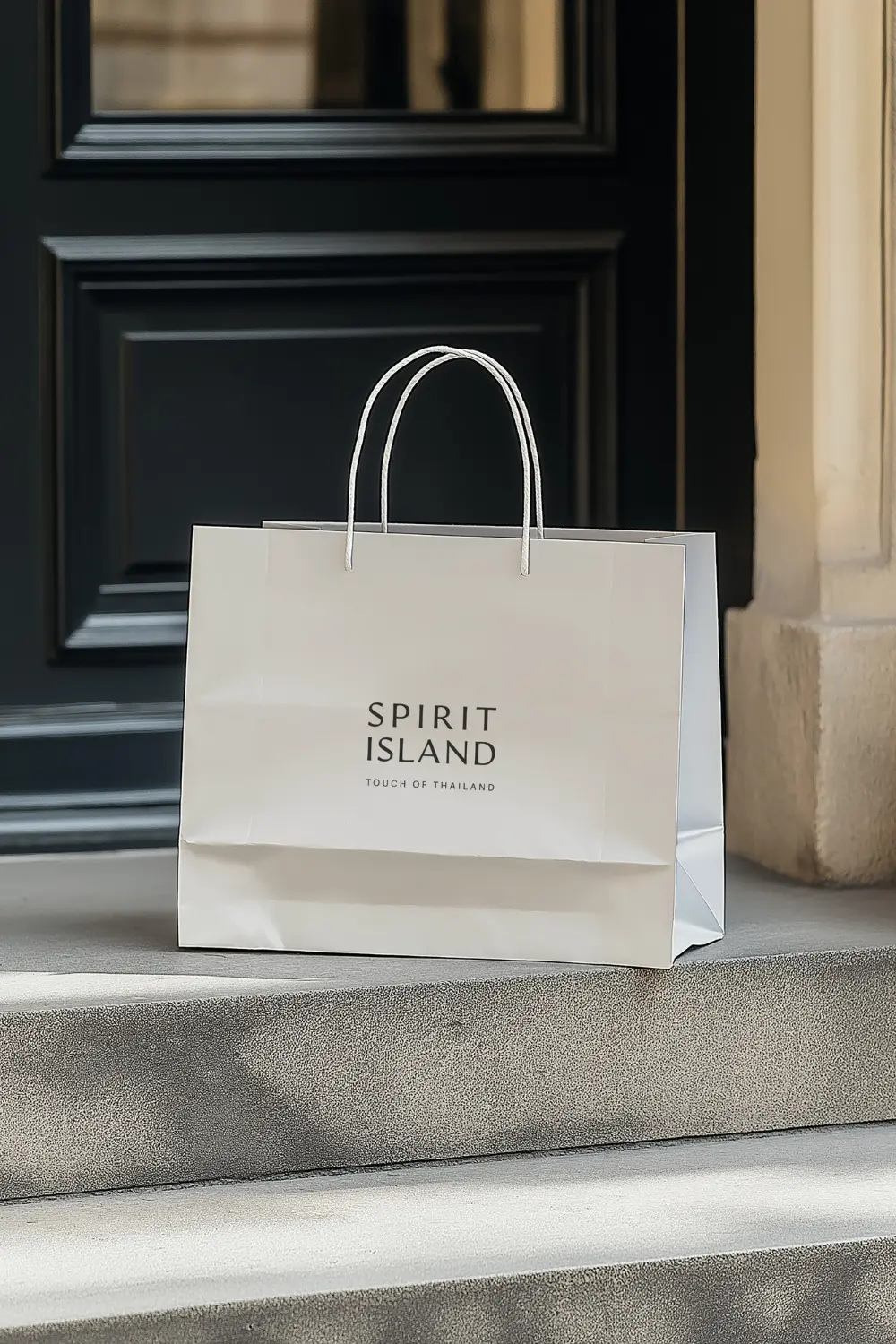
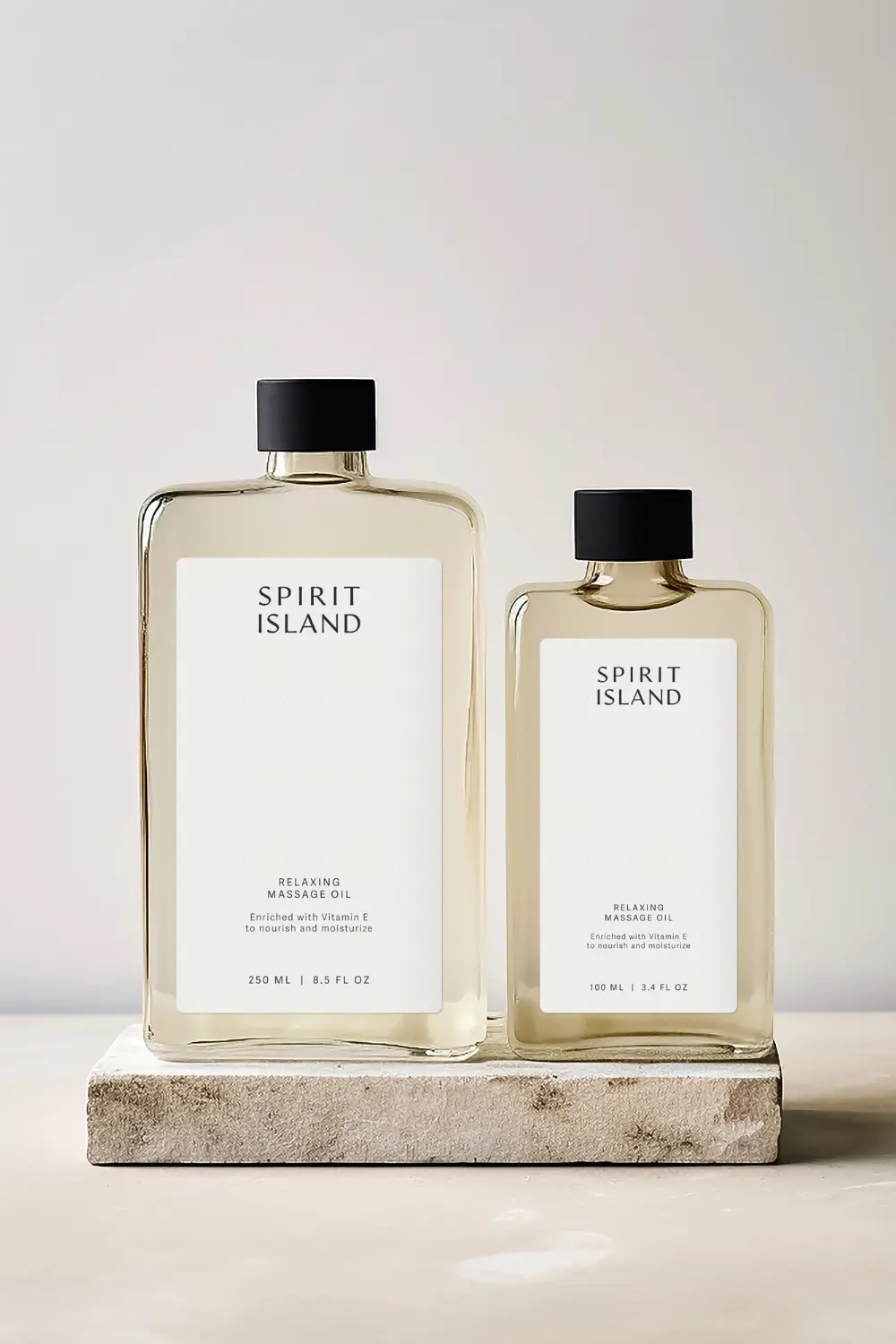
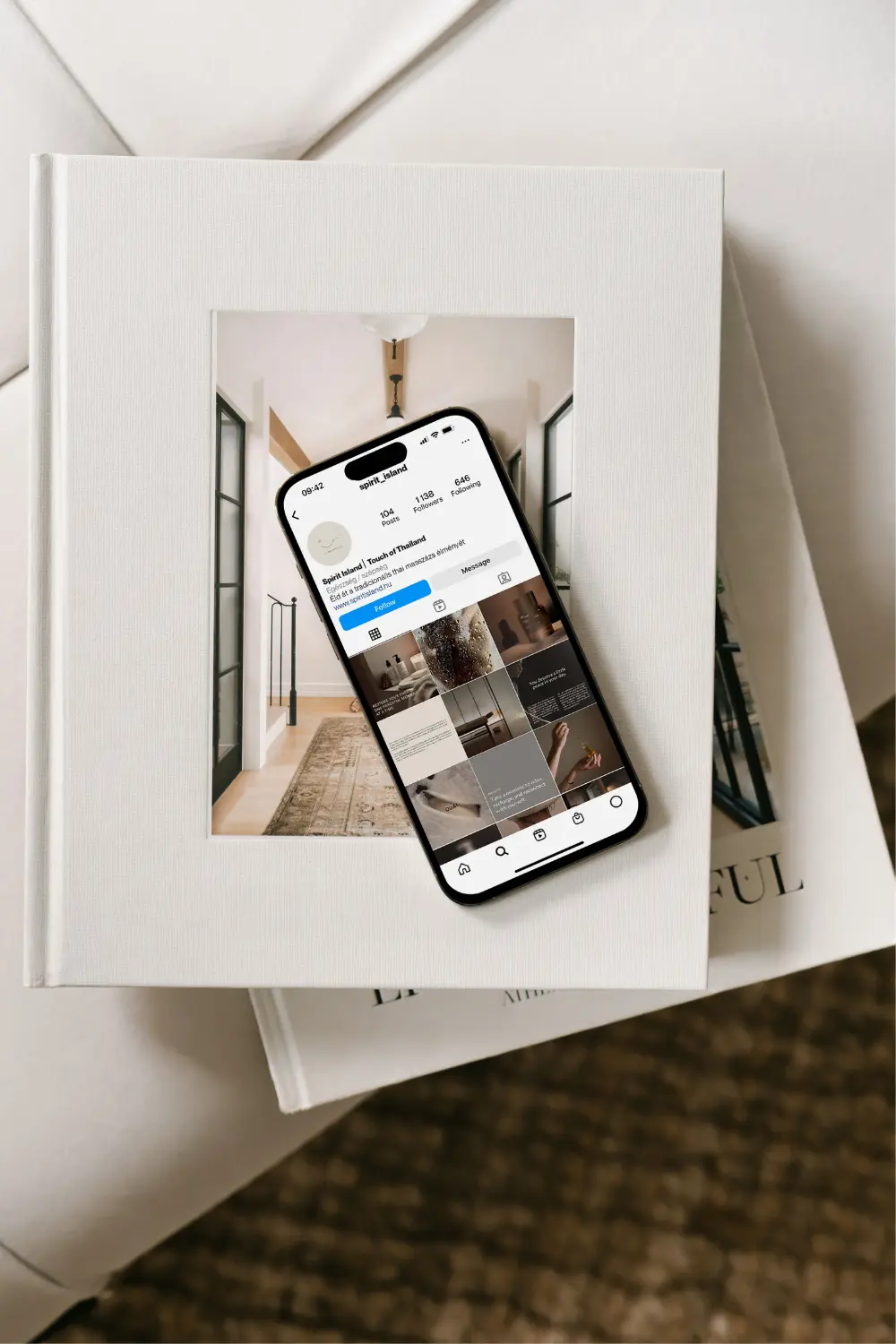
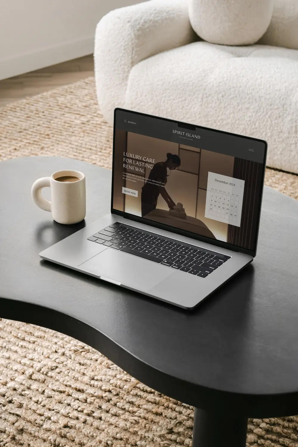
Thanks for their responsiveness, logos can be used in almost infinite ways and on an infinite number of surfaces, including packaging, printed products, and any online platforms.
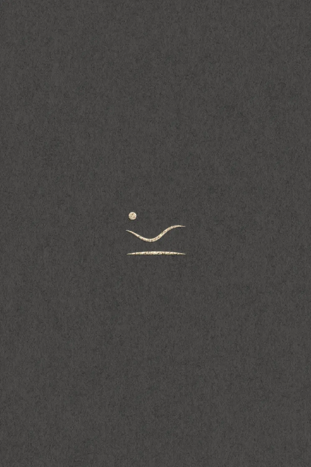
The icon logo of Spirit Island captures the essence of tranquility and renewal through its thoughtful design elements. At the heart of the icon lies a simplified depiction of a reclining figure. This elegant form symbolizes relaxation, comfort, and care, embodying the core experience guests can expect during their visit. It reflects the deeply restorative nature of the salon’s Thai massage treatments, where every moment is designed to soothe and rejuvenate.
Complementing the reclining figure is a gracefully curved line, representing an island. This subtle yet impactful element reinforces the brand’s promise of offering an escape to serenity. It evokes a sense of peaceful detachment from the stresses of everyday life, aligning perfectly with Spirit Island’s mission to be a tranquil sanctuary.
Together, these elements harmonize to create an icon that is minimal yet deeply meaningful. The interplay of forms conveys balance, renewal, and exclusivity, encapsulating the luxurious and transformative experience of Spirit Island.
Throughout the collaboration, I could feel her professionalism and attention to detail while also being flexible and open to my feedback. I am incredibly happy I chose her and would recommend her to anyone who wants a truly sophisticated and unique look. I am so grateful that she has made my vision a reality and created a wonderful image for our company! Thank you for your work, and I highly recommend you to everyone!”
Attila Fogas